HOW THE LOGO WAS MADE
|
|
REVISION ONE
|
|
ME |
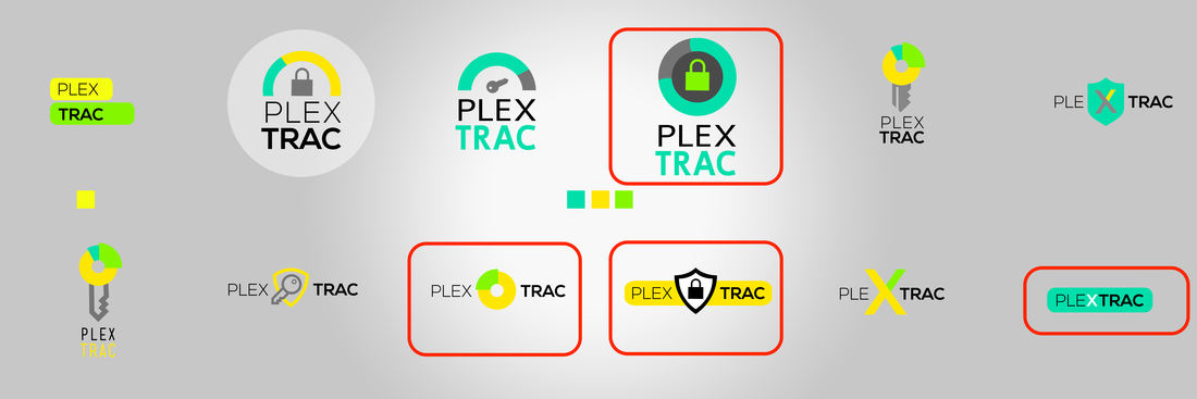
got a great start on your logo, a lot of options, take a look! |
CLIENT |
First round is looking good. I’ve circled a few that I like the initial concepts of. I like the gauge idea and look of the one in the top row, but not a fan of the lock. Rather than a traditional security icon, I’m wondering if we can incorporate and image simulating a Plexus (https://www.merriam-webster.com/dictionary/plexus), which is the root of the first part of PlexTrac. Keep iterating based on the ones I provided. I like the color scheme as well as long as you feel it works with the current colors on the app. Thanks a bunch and I’m always free to chat about any ideas over the phone or coffee if need be. |
|
|
REVISION TWO
|
|
CLIENT |
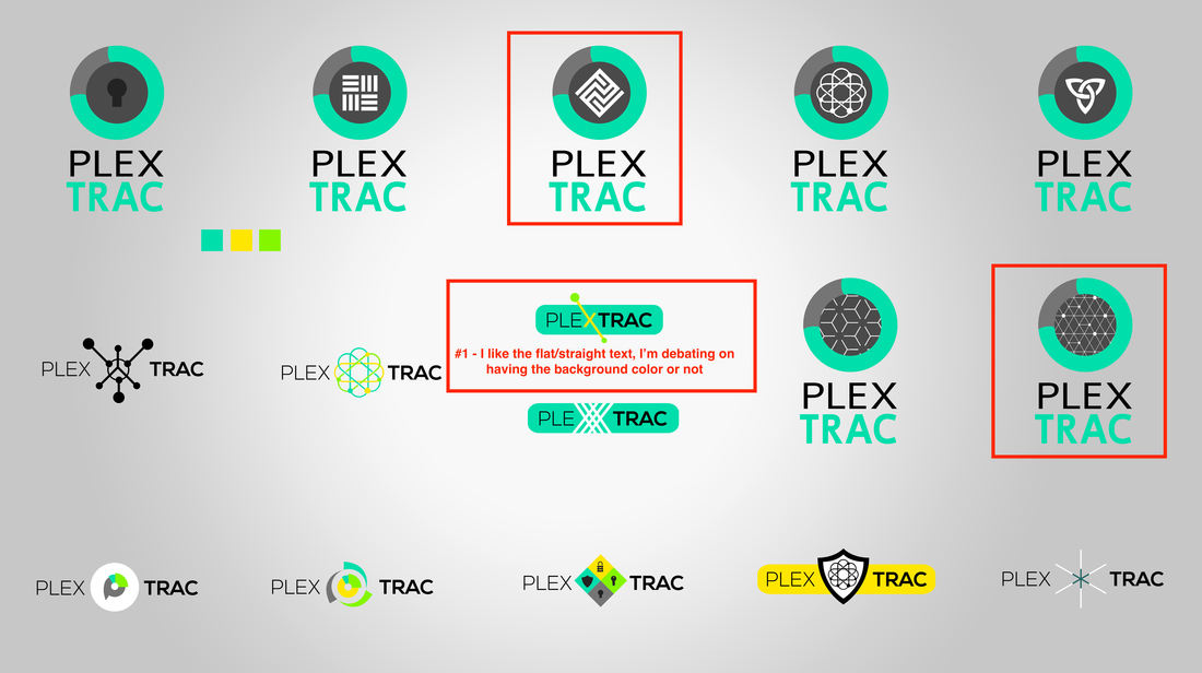
We’re getting really close. Attached are my edits and I will throw out some more thoughts. I really like the progress meter idea, but am drawn to the flat word (not stacked). So I’m not sure if there’s a way to incorporate the progress meter with the X and dots you have in the center logo without it getting to cluttered/busy. But chew on that a little bit more and let me know what you think. |
|
|
REVISION THREE
|
|
ME |
Here we go! I took the x puzzle shape, lined/dots background and horizontal text and worked with it. I mixed a couple combinations. Take a look! |
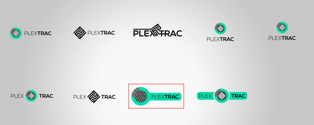
CLIENT |
I think we’ve settled! The red outlined one attached looks great. Can I get several variations of that image that I can put on a website, shirt, etc. Also can I get images of just the circular part that I could use as an icon for the site? |